Fact #105878
When:
Short story:
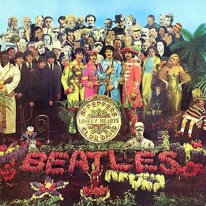 Artist Peter Blake's living collage, assembled for the cover of The Beatles' Sgt Pepper album, is photographed by Michael Cooper, in Chelsea, London, England, UK, Europe. The art of record packaging moves into a new era.
Full article:
Peter Blake : When I was first involved, it had already been decided that it would be called Sgt. Pepper's Lonely Hearts Club Band, and the uniforms had been made, so the idea of The Beatles calling themselves by another name already existed. Also, the concept of the actual record - to have it like a concert with an overture and a song by Billy Shears, followed by a song by someone else and so on with a reprise of the Sgt. Pepper song - was already there.
Paul McCartney : I said, give us a list of your top ten heroes. John, of course, got far out, as usual. He put Hitler and Jesus in. I put Einstein, Aldous Huxley, just various people that we’d read something of.
Peter Blake : Sgt. Pepper broke so much ground, not particularly because of me. The Beatles were at their absolute peak and power and I was quite inventive. And, if we decided to do something, they could go to EMI and say, 'This is what we want to do'. If EMI said 'No', then they wouldn't get the record. They were very powerful, so it meant that we could break through lots of barriers. One thing was the words on the back, another was that it was going to be the first double-album. It ended up as only one record, but it was a double-sleeve. They thought that there would be more material but there wasn't enough for two records, so then we compiled this sheet of things you could cut out, the Sergeant's stripes and the like, for inclusion in one of the pockets.
Paul McCartney : Originally the idea was going to be that this group was being given a presentation by a Lord Mayor on a kind of grassy knoll with like a floral clock which is very typical of Cleethorpes in Lancashire and all the parks – the floral clock. It was going to be that, and that might have said, ‘Congratulations Beatles’ or something.
And we were going to be standing receiving a silver cup or something from this guy. I drew it all out – little sketches …
I took all this to Peter Blake and he started developing them. He said, instead of the Lord Mayor and the floral clock, couldn’t we have all these heroes that we’d written these lists of?
Peter Blake : What I could offer was that perhaps they had just played a concert in a park. They were posing for a photograph and the crowd behind them was a crowd of fans who had been at the concert. Having decided on this, then, by making cut-outs, it could be anybody, dead or alive, real or fictitious. If we wanted Hansel and Gretel, I could paint them and they could be photographed and blown up. I asked the four Beatles for a list and I did one myself. Robert Fraser did a list and I can't remember whether Brian Epstein did. The way that worked out was fascinating. John gave me a long list and so did Paul. George suggested only Indian gurus, so there are about six of them, and Ringo said, 'Whatever the others say is fine by me', and didn't suggest anyone.
It's an interesting insight into their characters. All kinds of people were suggested. At one point Hitler was there, he is actually in the set- up, but he is covered by the Beatles themselves as we felt he was a difficult person to include. Jesus was there too and again we felt it was too controversial.
There were only two of their contemporaries on the cover. Bob Dylan was suggested by John and I put in Dion because he is a great favourite of mine. Presley was left out on purpose 'cause obviously if you were taking the top symbols he would have to be there. I can't remember why. Maybe they felt he wasn't making good records anymore.
Paul McCartney : It took Peter a few days to put it all together and, in the end, we just walked into it and grabbed a few silly instruments. And that was it, just a fantasy thing. What might we do if we were other people? And it all came together into this huge psychedelic explosion.
Mike Evans : The cover was created in three dimensions as you see it. That whole tableau was created and all those pictures of their heroes or whoever were life-size blowups of photographs, stuck onto hardboard and arranged on long wooden poles so that it looked like there were people actually grouped there. When the picture was taken, whoever was knocking around the studio took souvenirs as nobody thought it had any great significance. Peter Blake was left with half a dozen items, one of which, the blowup of the boxer Sonny Liston, stands in the corner of his study.
Alistair Taylor (General Manager, Apple) : The legal problems on the Sgt. Pepper cover were immense. The royalty was to be 1/2d, that is, in old money. We had to find the subjects or the executors of their estates and seek permission. Wendy Hanson sat at a desk for weeks sorting it all out.
Wendy Hanson (personal assistant to Brian Epstein) : I spent many hours and pounds on calls to the States. Fred Astaire was very sweet; Shirley Temple wanted to hear the record first; I got on famously with Marlon Brando, but Mae West wanted to know what she would be doing in a Lonely Hearts Club.
Peter Blake : The Beatles wrote her a personal letter, which they all signed, in which they said, 'It's not quite like that. We would love you to be in.' and she then agreed.
On the top row I put in two of the Bowery Boys but Leo Gorsey said that he wanted a fee. EMI wouldn't pay a fee so he was taken out. You'll see there's a gap at the top. Brian Epstein later thought, 'We could get rid of all these problems if we put it out in a brown paper envelope instead.'
The original Madame Tussaud's waxworks of the Beatles were included which, by this time, were rather old-fashioned, They had little, high-button jackets whereas the Beatles by this time were psychedelic and wearing daffodils. John came to the photographic session with a white silk scarf and a daffodil in his buttonhole and wearing all sorts of badges. They had moved on and the idea was to have this other band, the Beatles, looking at Sgt. Pepper's band. It was a comment on the fact that the record really wasn't made by the Beatles at all. The Beatles were just a part of the audience watching Sgt. Pepper's band.
Terry Southern (screenwriter) : I was probably one of the few people (on the cover) they knew who weren't icons of a sort. Most of the other faces on the cover were historical choices. I was closest to Ringo. Ringo was a very good friend of Harry Nilsson. Through Ringo, I met Harry, who I became grand good friends with and later worked on scripts like The Telephone for Hawkeye, a company that we formed.
Paul McCartney : And it wasn’t marijuana plants. They weren’t. the florist just brought them in, but it got around that they were pot plants. They weren’t. they were pot-plants not pot plants.
Peter Blake : There have been insulting parodies and there have been flattering parodies of the sleeve. To this day, you'll see cardboard cut-outs with photographs which come from the Sgt. Pepper idea. Usually I'm flattered but I think the one that the Mothers of Invention did on 'We're only in it for the Money' was spiteful. I have never liked Frank Zappa much.
-----------------------------------------------------------------------------
Peter Blake : The Beatles had invented the concept of a band within a band, and the concept of a concert with an overture and then a concert and then a reprise at the end. There was this Sgt. Pepper and a sort of German marching band. They also had ideas for uniforms…So we talked about the idea of a concert in a bandstand, in a park, and then it slowly evolved that there could be a crowd around the park.
I said, "If we’re having a crowd, how about working with a collage technique and make a giant collage? By making cutout figures, we could have a magic crowd of really anybody you want. I mean, anyone in the whole world, dead or alive or mythical or whatever you want, we could do."
So this evolved as an idea and we asked each Beatle to make a list of the people he would like in the magic crowd… John had put Hitler and Jesus on his list. It was generally agreed that it was just too controversial to put them in. But they’re there. They’re actually behind the four Beatles. They’re in the group, but at the last moment it was decided it was too much. So the Beatles are standing in front of them and you can’t see them. That was John’s sense of humour…
--------------------------------------------------------------------------
Maurice Gibb (Bee Gees) : The first time we met them at The Speakeasy, they’d just come back from doing the Sgt Pepper album cover and they were wearing those brilliant clothes. That was a fantastic night - Keith Moon, Otis Redding, Pete Townshend, all drinking scotch and coke, which was the drink then.
Barry Gibb (Bee Gees) : That was the first night I met Lennon. He was sitting with his back to me in the Pepper gear, taking to someone, and Pete Townshend said, ‘Do you want to meet John?’ So he took me over and went, ‘John, this is Barry Gibb from the group The Bee Gees.’ And, I’ll never forget it, he never turned round, didn’t look at me at all, just reached over his shoulder and shook hands with me and said, ‘Howyadoin?’ and then continued his conversation. I felt like digging a hole and burying myself.
--------------------------------------------------------------------------------------------
PUT THE MESSAGE ON THE BOX… an examination by Johnny Black of the art of record packaging (written in 1997)
1967 was the year in which record packaging came of age with Peter Blake’s epochal Sgt Pepper cover, which not only opened up seemingly limitless new vistas for designers but also signalled the beginning of a new power structure in the music industry.
As far back as there had been audio recordings, the destiny and the public image of musical stars had been in the hands of the record companies. But Sgt Pepper, with its costly montage, inserts and complete lyrics printed on a full-colour gatefold sleeve had been under The Beatles’ supervision from start to finish, effectively by-passing EMI’s art department. In the wake of the album’s runaway sales, Britain’s biggest record company could be seen to have lost control of its best-selling artists. And if The Beatles were calling their own shots, why shouldn’t the Rolling Stones, The Small Faces and even The Deviants? Nothing would ever be quite the same again.
In the beginning though, everything was the same. The original wax cylinders on which music was sold at the turn of the century were packaged in identical oblong cardboard boxes, lined with lint. Decoration? Merely a sticker bearing the name of the artist and title of the song.
Come 1910, though, cylinders were being replaced by shellac records, shipped out in paper covers, which were soon being adorned with designs proclaiming the name of the issuing recording company. Within a decade, sets of records were available bound together as albums - the origin of our current use of the word.
Although at least one edible chocolate disc had been manufactured much earlier, it wasn’t until 1933 that RCA made a giant stride in packaging by issuing Cowhand’s Last Ride by Jimmie Rodgers, reckoned to be first picture disc. The first square records followed a year later and coloured discs were not uncommon in the thirties.
All of these innovations were to re-appear in the rock era, although during the fifties and early sixties, imaginative packaging was deemed largely unnecessary. As Michael English, one of the sixties best-loved and respected psychedelic artists has observed, “The record industry had no great track record in visual creativity. All its energy was channelled into the music. The idea of creative packaging was quite alien.” It was the simultaneous arrival of pop art and psychedelia in the mid-sixties which turned everything around.
A wide-eyed new generation of designers and artists began turning on and turning out mind-boggling images in the garages, basements and tiny loft studios of Haight Street, Notting Hill Gate, Upper Broadway and wherever else mind-expanding chemicals were sold. The industry, points out English, “chose to soldier on as though nothing had happened… but you can’t keep your thumb over a bottle of coke and shake it. The stuff had to come out.”
After the initial shock-wave of Beatles, Velvets and Stones packages had passed, the subsidiary ripples spread out, first into imitations and, eventually, into new areas of creativity.
Rock’s first picture disc was Magical Love by Saturnalia in 1969, a year before Curved Air’s more celebrated Air Conditioning, but rather more imagination in the late sixties was spent on the creation of exotically unfolding marvels, most memorably the circular Ogden’s Nut Gone Flake package for The Small Faces in 1968, followed within a year by the pop-up figures of Jethro Tull’s Stand Up.
An eye-catching see-through plastic cover, over-printed with what appeared to be an X-Ray photograph of a hand, graced the equally see-through vinyl of Faust’s eponymous 1971 album, but for most of the early seventies, fold-outs were the special package of choice, most notably Barney Bubbles’ unfolding cover for Hawkwind’s In Search Of Space, and Man’s Be Good To Yourself At Least Once A Day featuring the impressive origami work of United Artists’ Art Director Pierre Tubbs. In 1972, Alice Cooper’s School’s Out, best remembered for coming, as it were, in a pair of disposable panties, also featured an unfolding school desk.
The first scratch’n’sniff cover also wafted out in 1972 from The Raspberries’ debut album. When scratched, this seminal power-pop artefact unleashed an aroma which, at least according to the publicity department, was reputed to have once been raspberries. The idea enjoyed a brief vogue, resulting in Melanie’s Garden In The City (flowers), The Akron Compilation (rubber) and Peter Tosh’s Legalise It (it).
“There was an international paper shortage in the mid-seventies,” points out notable sleeve designer and artist Roger Dean, “which virtually wiped out any kind of lavish packaging ideas for a long while. The record companies had to find cheaper ways of making covers.” A world crisis perhaps, but one which suited the punk ethic to a tee and helped fuel the wave of cheap’n’nasty imagery that proliferated as the seventies wore on.
By now, though, record companies were well aware of the existence of a growing market of obsessive collectors prepared to buy vinyl for reasons other than the music which, inconveniently, the companies were nevertheless contractually obliged to include in the grooves. The way was open for the spew of coloured vinyl, picture discs, exotic shapes and combinations of the three which flourished towards the end of the seventies. Better examples of the genre included the plectrum-shaped disc for John Cooper Clarke’s Gimmix (1978) and the badge-shaped disc for the Police’s Roxanne (1979).
Consumer enthusiasm for such gimmicks waned quickly and the eighties opened with a frantic search for new ones. The Psychedelic Furs debut single Dumb Waiters in 1981 was clad in a sleeve constructed round a 7” square flexi-disc, making it rock’s first playable cover. In the same year, the vinyl of Split Enz True Colours was laser etched to achieve a rainbow-like effect.
The arrival of compact discs in the mid-80s seemed, at first, to signal the end of imaginative packaging. Music lovers were now prepared to buy their old records again in the shamefully over-priced new format, so artwork was barely an issue. Besides, the combination of a sterile plastic container and a reduced surface area seriously challenged the ingenuity of designers until, in 1993, Mark Farrow’s bobbly orange plastic box for The Pet Shop Boys’ Very suggested there might finally be some mileage in packaging the new medium. In a trice, Ned’s Atomic Dustbin had an embossed metal package, The Orb had a clear-plastic slip case overlaid with an Escher cube and the game was on again.
Even so, as late as 1995, Storm Thorgersson, founder of the Hipgnosis design group which had produced notable covers for Pink Floyd and Led Zep was grumbling “CDs are a bit of a drag. You wouldn’t have a book that size unless you were into squinting.” In the same year, however, Storm was responsible for the Floyd’s P.U.L.S.E. with its flashing red L.E.D. in the spine.
“Special packaging has become a terrible manipulation of the fans,” says a clearly irked Peter Savile. “Multiple formats exist purely to con them into buying extra copies of the same CD. When we did it at Factory in the 80s, we didn’t know what effect if had on sales. Nobody looked at the balance sheets. We just wanted to give the customers something interesting. I remember it came as a shock to New Order when they realised that, although Blue Monday was the best selling 12” ever, they wouldn’t make any money from it because my sleeve was costing 50p per unit, which ate up the profit.”
As awareness of the financial implications of packaging filters through to artists of the late 90s, hard commercial decisions are being made. “Now, a manager will tell his band they can have £50,000 in their pocket,” says Savile, “or they can have beautiful inlaid gold lettering on their CD at 1p per unit. They can see the new Porsche disappearing, so you know what they’ll choose.”
Island Records design chief Cally Calloman adds, “From a purely economic standpoint, most companies would rather not do lavish packaging, but it has become driven by fear. If one company has a successful artist, and uses some outlandish package, all the other companies jump on the bandwagon for fear that they’ll miss out.”
Calloman sees some justification for the use of packaging gimmicks with teen acts like the Spice Girls or Boyzone, because “after all, you’re really just selling toys”, but argues that when more mature artists involve themselves in packaging wars, they take their eye off the ball musically. Citing the example of Morrissey’s Southpaw with its attendant book of photographs of the star, he wonders whether such an artefact is there because the fans want it, or because it panders to the star’s ego.
Recent brouhahas surrounding such packages as the latest Paul Weller album, which was ineligible for chart entry because it contained too many free postcards, have focused the industry’s attention on just how far the packaging wars have gone. The C.I.N. Chart Committee is expected shortly to reduce the number of formats allowed per release to two, and to strictly regulate the use of lavish or exotic packaging, in an attempt to focus attention back onto the music.
Some companies, invevitably, remain committed to operating at the cutting edge of packaging, which, in the foreseeable future seems to involve holograms. “It’s a new visual language,” says Chris Levine of i-c, a company specialising in what he terms techno-visuals. “We’ve been involved in making a lot of holographic images, but the best stuff is still to come.” He’s referring to Holomovies, the technique by which up to four seconds of full-colour animation can be captured in a hologram and foil-blocked onto the cover of an album.
Levine is also working on startlingly life-like 3-D hologam portraits of Oasis, Kylie Minogue and others, but he warns that “the technology isn’t the point. It’s just a tool. What matters is the imagination and the image you create with that technology.”
But do music fans really want lavish packaging? “I don’t think they do,” reckons Cally Calloman. “I was in one of those giant airport lounges they call a record shop in Leeds once when a guy came in to buy the new Peter Gabriel single. The assistant brought one out from behind the counter, done up in what looked like a little church door which opened to get to the CD. The guy paid for it, ripped the CD out, dumped the package on the counter and walked off. He just wanted his music. Isn’t that a heartening thought?"
SOME GREAT MOMENTS IN THE EVOLUTION OF ALBUM PACKAGING
1966 : The Velvet Underground and Nico.
The point at which rock music and fine art collided. The Velvet Underground had become part of Warhol’s decadently chic Factory set in New York, and the relationship was useful to both parties. The Velvets dusted Warhol with rock glitz, and he gave them a whiff of art. Inevitably, when their first album appeared, Warhol designed the cover. His first intention, to base the cover on photographs of plastic surgery scars, proved inexplicably unacceptable to Verve Records, so he substituted the now legendary banana, which could be peeled off the cover to reveal a pink and decidedly phallic fruit underneath.
The back cover, however, proved more troublesome to The Velvets when dancer Eric Emerson sued the record company for including his picture on it without a signed release. As a result, MGM withdrew the album from sale.
1967 : The Deviants - Ptooof!
Deviants founder Mick Farren points out that what appeared to be an expensive and innovative sleeve design was, in fact, born out of adversity. “We couldn’t get a deal with a real record company, so we borrowed £800 and did it ourselves. Only when we finished did we realise we’d need a cover, but the cost of a proper one was beyond us.” Spurred on by hearing The Stones’ plans for Satanic Majesties, The Deviants were determined to make something equally innovative but at a fraction of the cost. “We knew an artist called Kipps, and asked him to do something in the style of Marvel Comics’ artist Neal Adams, with a bit of Steve Ditko about it too.” The resulting 48” by 36” illustration was silkscreened onto card by the printers who did posters for the UFO Club, then hand-folded in an all-night session by the band members themselves.
1967 : The Beatles : Magical Mystery Tour.
Although The Beatles had employed fine artist Peter Blake to create their celebrated Sgt Pepper sleeve, there was still no established framework in the music industry for the creation of album artwork that called for more than a colour picture of the artist on the front and a self-congratulatory sleeve note on the back. “The Mystery Tour packaging was all Paul’s idea,” remembers their publicist Tony Barrow. “Everything happened in a mad rush after Brian Epstein died, because Paul was worried that the band would simply fall apart with some guidance. Mystery Tour was his attempt to give some kind of leadership.”
The first meetings about Mystery Tour were in McCartney’s Cavendish Avenue home during September and a week later filming began. “It was October before we even began to think about packaging,” points out Barrow. “There was no designer as such. Paul had the idea to make it like a mini-double album, and he and I worked on the text together. Finally, we called in Bob Gibson, the illustrator for Beatles Monthly, to provide a cartoon version of the film. It was in the shops before Christmas.”
1967 : Rolling Stones : Their Satanic Majesties Request.
Long-time Stones’ photographer Michael Cooper dreamed up his $25,000 concept sleeve when he acquired a state of the art 3-D camera specially imported from Japan. Hoping to out-Pepper The Beatles, he and the band, armed with cans of spray paint, retired to the studio of Pictorial Production in Mount Vernon, New York during September 1967. As Bill Wyman has recalled, “There were piles of stuff all over the studio, just like Christmas decorations. I hung up the Saturn thing to float from the ceiling. We added our own little artistic touches to it and went out to get clothes, plants and foliage. We put the faces of The Beatles in some of the flowers. We kept popping out to buy things when we ran out.”
1972 : Jethro Tull : Thick As A Brick.
Roy Eldridge, former MD of Chrysalis Records was drawn into the creation of Tull’s most ambitious cover concept. “In fact, it was the most time-consuming cover I’ve ever been involved in. We spent months on it.” Tull’s Iain Anderson provided the original spark by suggesting a local newspaper theme and initial plans were to manufacture it entirely from newsprint, until it was pointed out that newsprint deteriorates rapidly with handling. “We compromised by having a card cover with newsprint pages inside,” remembers Eldridge, whose early background in local papers proved invaluable in deciding the content of what became the first and last edition of The St. Cleve Chronicle. “We had fun with in-jokes. The groom in the wedding photo, for example, is Terry Ellis who had co-founded the label. The roller skate champion was our engineer Robin Black. The crossword clues are all about the content of the album, and there’s even an album review which Iain wrote himself.” Now, of course, such a lavish package would be a limited edition aimed at boosting early sales to achieve a chart position, but then as Eldridge observes, it extended to the whole run of the album, starting with an initial UK pressing of 100,000 copies.
1973 : ELP : Brain Salad Surgery.
This striking multi-layered unfolding cover emerged after E.L.&P. were taken to meet Swiss artist H.R.Giger at his home in Zurich. “Straight away, Giger struck me as heavy, to say the least,” recalls Emerson. “From floor to ceiling, he’d used his airbrush technique to transform the room into a Gothic cathedral. Even his toilet had arms coming out to embrace the sitter.”
Giger was dismayed to learn that the album’s original title, Whip Some Skull On Ya, had been changed “until Keith explained to me that the new title also indicated fellatio.” Suitably enthused, Giger executed a sado-masochistic slab of extreme fetishism in which a swollen phallus thrust itself towards the lips of the woman on the cover. It was with some reluctance that he bowed to record company pressure to change the image to a shaft of light.
1973 :Yes : Yessongs.
Roger Dean’s fantastical visions of other worlds were an intrinsic artistic complement not only to the music of Yes, but to the whole of the early seventies progressive rock scene. His widescreen spacescapes found their ideal vehicle in the his design for the triple live set, Yessongs. The first 10,000 had appeared in a book format, but to reduce costs on later editions, Dean invented a way to make a quadruple-folding cover out of one sheet of card, which displayed his paintings to impressive effect.
“Visually, the idea was a continuation of the story I’d started on their album Fragile which showed a planet being destroyed,” he explains. “The Yessongs paintings showed seeds from that world drifting through space and starting life cycles on new worlds.”
1975 : Steeleye Span : All Around My Hat.
Anamorphic projection, a drawing technique which had provided hours of innocent amusement in Victorian parlours, was revived briefly for this album by painter/designer John O’Connor. The technique involves the painstakingly accurate drawing of distorted images which can only be restored to normality by viewing them in a particular way. In this case, three holes must be punched in a card insert which came with album. By bending the card and peering through the holes, the distorted faces of band members are restored to normality.
1980 : Orchestral Manoeuvres In the Dark.
It’s no exaggeration to say that Peter Savile has revolutionised record company attitudes to packaging in the last two decades of the 20th century, perhaps even more than Peter Blake did in the 60s.
His elegantly simple cover for OMD’s debut unintentionally sparked a marketing re-think whose repercussions are still felt. “I had been very impressed by Talking Heads cover for Fear of Music which used a non-slip flooring design and I wanted something with that feeling for OMD,” he recalls. He was kicking ideas around with hi-tech design pioneer Ben Kelly who had built metal frames for OMD’s stage presentation when Kelly suggested he should drive past the office of Lynne Franks PR, whose door Kelly had designed.
“The door was a sheet of perforated steel,” says Savile, “exactly what I wanted for OMD. I went through the Associated Perforators And Weavers Catalogue, chose the one I liked best and applied it to the cover.” To his dismay, the record company marketing team hated it. “I can see their point of view. This was a virtually unknown band and what I’d done didn’t look like a conventional cover, and it didn’t even have a picture of the band on it.”
Support came from the top. Carol Wilson, the company MD who had signed the band and contracted Savile, backed him to the hilt.
Savile’s relief when the sales team got great feedback from the stores turned to glee when the first pressing sold out. “We had to re-order, so I suggested we should change the colours of the sleeve, just for fun. Again, Carol backed me up against some opposition.” This time, when the feedback came in, it was learned that the same kids were coming back and buying the same record again to get the new package.
“Nothing like that had ever happened before,” says Savile. “Within days it completely turned around the company’s thinking on the value of packaging. They realised it could sell the same piece of music to the same person more than once.”
1980 : Closer : Joy Division.
Within months of his revolutionary OMD cover, Peter Savile came up with an entirely different, but almost as influential, design for Joy Division. The end of the seventies had been dominated by the stark, ugly and busy images of punk. For Closer, Savile initiated a return to the classic design values of labels like Deutsche Grammophon. An unfussy but atmospheric black and grey half-tone picture of a tomb in an Italian cemetary was centred above “the oldest type-face I could find - lapidary serif lettering from the 2nd century B.C.”
When he designed it, he hadn’t even heard the music, but Joy Division’s leader Iain Curtis declared it perfect. Ironically, within weeks, Curtis had committed suicide. “And we had a tomb on the cover,” points out Savile. “We had a meeting with the band and they unanimously said we had to use that image, because Iain had wanted it.”
1981 : Squeeze : The Goodbye Girl.
Mike Ross, then head of A&M’s art department, found Squeeze always up for a bit of fun. “A new technique was starting to come in called vaccuum-forming which I realised we could use to add a kind of depth effect to a sleeve. The cover was designed to look like a comic-strip panel, but with the addition of the vaccuum-formed plastic stick-ons for the Squeeze logo and the guy’s head, the end result is kind of like a bas-relief.”
1986 : Wild Willy Barret : Organic Bondage.
It was at a gig in the West Country that John Otway’s old oppo ran into the Bristol Gnomes. “They came up and said to me ‘We do to wood what you do to music.’” Intrigued by their claim, Wild Willy investigated further, and discovered that the Gnomes were dab hands at doing almost anything with a sheet of plywood and an angle grinder.
“I’d just finished an album for my own label,” says Willy, “but I couldn’t afford to get sleeves printed, so I decided to make them.” To his specs, the Gnomes supplied squares of 6mm marine plywood, which Willy glued together throughout the months of May and June, carpenting a limited edition of 1000 albums in hand-made wooden boxes, fully guaranteed against woodworm.
1991 : Downward Spiral : Nine Inch Nails.
The change in attitude about exactly what can constitute an effective album package is well illustrated by the work of contemporary artists like Vaughan Oliver and Russell Mills whose often sumptous concoctions can appear quite abstract but often conceal layers of subtextual significance. Mills, for example, was invited to fly to Los Angeles for one night to meet with Trent Reznor before the Downward Spiral album was completed. “A very strange guy,” notes Mills. “He won’t work with anyone he hasn’t met but all he told me was that the music was concerned with themes of attrition and decay. With just that as my brief, I was given about four weeks to come up with ten images.”
The most striking of these is probably the album cover, a multi-media painting-cum-collage which incorporates real bandages and blood, burn marks, wax, a slab of rusted metal and even dead insects which Mills collected on country walks. “When it’s all brought together,” points out Mills, “it kind of celebrates the way nature and weather can bring about strikingly beautiful changes through decay which we often don’t even notice.”
1995 : Tricky : Maxinquaye.
Island Records art director Cally Calloman took particular pleasure in devising a limited edition package for this one. “Tricky had such a reputation that people were just desperate to hear this music. I came up with a tiny version of a Vietnamese body bag which had to be ripped open to get at a hand-sewn red crushed velvet pouch which you’d have to cut open before you finally get to the CD. What I liked about it was that there are now so many anal collector types around that loads of people, even though they wanted to hear the music, would be unable to bring themselves to destroy the package.”
1995 : Brian Eno boxes.
Close examination of Russell Mills’ boxes for Brian Eno’s CD retrospective sets reveals how closely their design echoes Eno’s modus operandi. “Brian’s music is on the fringe, off-centre, unsymmetrical, and always celebrates the happy accident,” says Mills, “and I wanted to create a visual reflection of that.” It helped that Virgin had budgeted big for this project, enabling Mills to create lavish boxes with the appearance of coming from a top design house but which, at the last moment of production, had fallen into the hands of incompetent minions. “We used some lovely old American postcards but had them printed hopelessly out of register, so they looked almost like potato prints. We even made trompe l’oeil cigarette burn marks and coffee cup stains, and tested the printer’s resolve by insisting that they must be spot-varnished to make them stand out.”
1995 : B-52s : Is That You Modine
The beginnings of what may prove to be the biggest evolution yet in rock images, appeared with Chris Levine’s dot matrix hologram of robots and spaceships around the perimeter of Is That You Modine. “WEA came to me and asked what was the latest thing in holographic imaging,” says Levine, whose company i-c specialises in this area. “At that time, a company called Nimbus in Monmouthshire had just developed a technique called 3DiD which enabled the reproduction of holograms which were visible in normal light onto CD surfaces.”
The catch was that, as the image appeared on the same side as the music, playing time was restricted. This was overcome with Edge To Edge 3DiD, first used on Spacehog’s In The Meantime, in which the image covered the entire surface of the non-playing side, enabling the technique to be applied to albums.
1996 : Octopus : From A to B.
The fine art of paper-folding, seemingly lost after its wave of popularity in the 70s, is finally being applied to CD packages. Rob O’Connor at Stylo Rouge spent about three months devising a multi-flap fold-out game with playing pieces on cut-out inserts, for new band Octopus. “Their press shots showed them playing a game, and the title of the album, From A To B, also suggested some sort of movement on a game board,” explains Rob. “I wanted to get that feeling of a compendium of games, which we all got as presents when we were kids.” The concept worked better with a digipak than it would have with the standard plastic CD jewel box but Rob points out that the hardest task was the first one, devising a game that not only worked but also didn’t either end too quickly or drag on too long.
1996 : Tool : Aenima
A new method of achieving a moving image on a CD package, was introduced on mid-90s CDs from East 17, Timothy Leary and others, but perhaps the most imaginative example was for Tool’s album Aenima.
The technique involves creating a series of images, usually by drawing or photography, which are then digitised and interlaced by computer so that, to the naked eye, they appear blurred and indistinct. But by converting a normal transparent CD jewel box cover, through the use of a ribbed surface, into a renticular lens, the image seems to move. The Tool package gave buyers a range of optional images, chosen from an inlay card which folded out to offer a total of eight possible covers.
1997 : Spiritualised : Ladies And Gentlemen We Are Floating In Space
Issued in a simulation of pharmaceutical packaging by Mark Farrow at Farrow Designs. Dedicated Records, struggling for a design concept, had sounded out a number of design consultancies but Farrow came up with his blindingly simple and appropriate idea in the space of five minutes.
1997 : Novak : Silver Seas.
For proof that the D.I.Y. vibe still radiates in 1997, look no further than Novak. To embellish this experimental Birmingham pop combo’s November 1996 debut, Silver Seas, vocalist Adele Wilson cashed in on her dress-making ‘O’ level by adorning a limited edition of two hundred 7” singles each with its own unique hand-sewn fabric cover. “I cut up old clothes, curtains, jumpers, anything. One came from a foul old dress I never wore, one had a zipper in it, some even had pockets with things like sweet-wrappers still in them. I even stitched in name tags saying ‘Hand-knitted by Novak’ and finished it off by stapling an Earworm Records stamp to each one.” For their second single, Rapunzel, released earlier this year, they adopted a colouring book theme, with each cover hand-painted by the band.
THE ART OF FALLING APART – some memorably bad examples of record packaging
Soft Cell : Say Hello Wave Goodbye
It looked so appealing in its richly coloured ‘leather’ packet until, within weeks of purchase, unwary buyers discovered that the dye from the packet was eating the CD away.
Durutti Column - Return Of :
The abrasive sandpaper exterior, devised by Tony Wilson of Factory Records, irreparably damaged the cover of anything it was stacked against. Worse, once the sandpaper’s glass granules started to fall off, they invariably found their way inside other record covers and scratched the playing surfaces.
Small Faces : Ogden’s Nut Gone Flake.
Universally admired as an innovative and appropriate package for a concept album, it was a nightmare in the shops. Being circular it tended to roll off the shelves. Being a gatefold joined by small pieces of scored card, it tore easily when browsing customers picked it up. And prizes were awarded to store managers who could figure out where to place their stock control cards. Mind you, torn into small pieces, it made damn fine roaches.
Santana : Lotus.
Triple Japanese import whose sleeve folded out. And out. And out again, ending up roughly the size of an emperor sized eiderdown. Ingenious, except that folding it back up again required two weeks in a school gymnasium and a master’s degree in origami.
Peter Tosh : Legalise It.
The scratch’n’sniff cover smelling, reputedly, of a certain pungent herb, caused an outbreak of casual customers furtively ripping open the shrink-wrap cover, scratching, sniffing contentedly, then wandering off without buying.
Alice Cooper : Muscle Of Love.
Came in a corrugated cardboard mailer about half an inch thick which meant that in the shops, one copy took up the usual space of five albums, The design also proved an irresistible temptation for staff at CBS distribution who, on a number of occasions, substituted thin’n’crispy pizza for the vinyl. It’s best not to even ask what happened if those copies didn’t sell for a few weeks.
Tears For Fears : Sowing The Seeds Of Love.
A 3” CD in a 7” sunflower-shaped plastic container. It was bad enough that extreme digital dexterity was required to remove the centre of the sunflower and thus remove the single, but to make matters worse it couldn’t stand upright and refused to stack flat.
Gaye Bikers On Acid : Drill Your Own Hole.
This paean to the pleasures of D.I.Y. sex evoked the similar but less subtle synonym “Go F$£& Yourself” once purchasers realised that the record had no hole.
9) P.I.L. : Metal Box.
A circular film can containing a set of three 12” 45rpm vinyl biscuits. These fitted so snugly inside that removing them was a task of the utmost delicacy and, being separated merely by paper circles, were easily damaged. And, like Ogden’s Nut Gone Flake, it spent as much time rolling along the floor as it did on the shelves.
Rolling Stones : Sticky Fingers.
The zipper cover designed by Andy Warhol caused endless headaches at retail level because it invariably ripped the next record on the shelf and, in the stock rooms, resisted all attempts to stack it upright.
-----------------------------------------------------------------------------------
Tweet this Fact
Paul McCartney : I said, give us a list of your top ten heroes. John, of course, got far out, as usual. He put Hitler and Jesus in. I put Einstein, Aldous Huxley, just various people that we’d read something of.
Peter Blake : Sgt. Pepper broke so much ground, not particularly because of me. The Beatles were at their absolute peak and power and I was quite inventive. And, if we decided to do something, they could go to EMI and say, 'This is what we want to do'. If EMI said 'No', then they wouldn't get the record. They were very powerful, so it meant that we could break through lots of barriers. One thing was the words on the back, another was that it was going to be the first double-album. It ended up as only one record, but it was a double-sleeve. They thought that there would be more material but there wasn't enough for two records, so then we compiled this sheet of things you could cut out, the Sergeant's stripes and the like, for inclusion in one of the pockets.
Paul McCartney : Originally the idea was going to be that this group was being given a presentation by a Lord Mayor on a kind of grassy knoll with like a floral clock which is very typical of Cleethorpes in Lancashire and all the parks – the floral clock. It was going to be that, and that might have said, ‘Congratulations Beatles’ or something.
And we were going to be standing receiving a silver cup or something from this guy. I drew it all out – little sketches …
I took all this to Peter Blake and he started developing them. He said, instead of the Lord Mayor and the floral clock, couldn’t we have all these heroes that we’d written these lists of?
Peter Blake : What I could offer was that perhaps they had just played a concert in a park. They were posing for a photograph and the crowd behind them was a crowd of fans who had been at the concert. Having decided on this, then, by making cut-outs, it could be anybody, dead or alive, real or fictitious. If we wanted Hansel and Gretel, I could paint them and they could be photographed and blown up. I asked the four Beatles for a list and I did one myself. Robert Fraser did a list and I can't remember whether Brian Epstein did. The way that worked out was fascinating. John gave me a long list and so did Paul. George suggested only Indian gurus, so there are about six of them, and Ringo said, 'Whatever the others say is fine by me', and didn't suggest anyone.
It's an interesting insight into their characters. All kinds of people were suggested. At one point Hitler was there, he is actually in the set- up, but he is covered by the Beatles themselves as we felt he was a difficult person to include. Jesus was there too and again we felt it was too controversial.
There were only two of their contemporaries on the cover. Bob Dylan was suggested by John and I put in Dion because he is a great favourite of mine. Presley was left out on purpose 'cause obviously if you were taking the top symbols he would have to be there. I can't remember why. Maybe they felt he wasn't making good records anymore.
Paul McCartney : It took Peter a few days to put it all together and, in the end, we just walked into it and grabbed a few silly instruments. And that was it, just a fantasy thing. What might we do if we were other people? And it all came together into this huge psychedelic explosion.
Mike Evans : The cover was created in three dimensions as you see it. That whole tableau was created and all those pictures of their heroes or whoever were life-size blowups of photographs, stuck onto hardboard and arranged on long wooden poles so that it looked like there were people actually grouped there. When the picture was taken, whoever was knocking around the studio took souvenirs as nobody thought it had any great significance. Peter Blake was left with half a dozen items, one of which, the blowup of the boxer Sonny Liston, stands in the corner of his study.
Alistair Taylor (General Manager, Apple) : The legal problems on the Sgt. Pepper cover were immense. The royalty was to be 1/2d, that is, in old money. We had to find the subjects or the executors of their estates and seek permission. Wendy Hanson sat at a desk for weeks sorting it all out.
Wendy Hanson (personal assistant to Brian Epstein) : I spent many hours and pounds on calls to the States. Fred Astaire was very sweet; Shirley Temple wanted to hear the record first; I got on famously with Marlon Brando, but Mae West wanted to know what she would be doing in a Lonely Hearts Club.
Peter Blake : The Beatles wrote her a personal letter, which they all signed, in which they said, 'It's not quite like that. We would love you to be in.' and she then agreed.
On the top row I put in two of the Bowery Boys but Leo Gorsey said that he wanted a fee. EMI wouldn't pay a fee so he was taken out. You'll see there's a gap at the top. Brian Epstein later thought, 'We could get rid of all these problems if we put it out in a brown paper envelope instead.'
The original Madame Tussaud's waxworks of the Beatles were included which, by this time, were rather old-fashioned, They had little, high-button jackets whereas the Beatles by this time were psychedelic and wearing daffodils. John came to the photographic session with a white silk scarf and a daffodil in his buttonhole and wearing all sorts of badges. They had moved on and the idea was to have this other band, the Beatles, looking at Sgt. Pepper's band. It was a comment on the fact that the record really wasn't made by the Beatles at all. The Beatles were just a part of the audience watching Sgt. Pepper's band.
Terry Southern (screenwriter) : I was probably one of the few people (on the cover) they knew who weren't icons of a sort. Most of the other faces on the cover were historical choices. I was closest to Ringo. Ringo was a very good friend of Harry Nilsson. Through Ringo, I met Harry, who I became grand good friends with and later worked on scripts like The Telephone for Hawkeye, a company that we formed.
Paul McCartney : And it wasn’t marijuana plants. They weren’t. the florist just brought them in, but it got around that they were pot plants. They weren’t. they were pot-plants not pot plants.
Peter Blake : There have been insulting parodies and there have been flattering parodies of the sleeve. To this day, you'll see cardboard cut-outs with photographs which come from the Sgt. Pepper idea. Usually I'm flattered but I think the one that the Mothers of Invention did on 'We're only in it for the Money' was spiteful. I have never liked Frank Zappa much.
-----------------------------------------------------------------------------
Peter Blake : The Beatles had invented the concept of a band within a band, and the concept of a concert with an overture and then a concert and then a reprise at the end. There was this Sgt. Pepper and a sort of German marching band. They also had ideas for uniforms…So we talked about the idea of a concert in a bandstand, in a park, and then it slowly evolved that there could be a crowd around the park.
I said, "If we’re having a crowd, how about working with a collage technique and make a giant collage? By making cutout figures, we could have a magic crowd of really anybody you want. I mean, anyone in the whole world, dead or alive or mythical or whatever you want, we could do."
So this evolved as an idea and we asked each Beatle to make a list of the people he would like in the magic crowd… John had put Hitler and Jesus on his list. It was generally agreed that it was just too controversial to put them in. But they’re there. They’re actually behind the four Beatles. They’re in the group, but at the last moment it was decided it was too much. So the Beatles are standing in front of them and you can’t see them. That was John’s sense of humour…
--------------------------------------------------------------------------
Maurice Gibb (Bee Gees) : The first time we met them at The Speakeasy, they’d just come back from doing the Sgt Pepper album cover and they were wearing those brilliant clothes. That was a fantastic night - Keith Moon, Otis Redding, Pete Townshend, all drinking scotch and coke, which was the drink then.
Barry Gibb (Bee Gees) : That was the first night I met Lennon. He was sitting with his back to me in the Pepper gear, taking to someone, and Pete Townshend said, ‘Do you want to meet John?’ So he took me over and went, ‘John, this is Barry Gibb from the group The Bee Gees.’ And, I’ll never forget it, he never turned round, didn’t look at me at all, just reached over his shoulder and shook hands with me and said, ‘Howyadoin?’ and then continued his conversation. I felt like digging a hole and burying myself.
--------------------------------------------------------------------------------------------
PUT THE MESSAGE ON THE BOX… an examination by Johnny Black of the art of record packaging (written in 1997)
1967 was the year in which record packaging came of age with Peter Blake’s epochal Sgt Pepper cover, which not only opened up seemingly limitless new vistas for designers but also signalled the beginning of a new power structure in the music industry.
As far back as there had been audio recordings, the destiny and the public image of musical stars had been in the hands of the record companies. But Sgt Pepper, with its costly montage, inserts and complete lyrics printed on a full-colour gatefold sleeve had been under The Beatles’ supervision from start to finish, effectively by-passing EMI’s art department. In the wake of the album’s runaway sales, Britain’s biggest record company could be seen to have lost control of its best-selling artists. And if The Beatles were calling their own shots, why shouldn’t the Rolling Stones, The Small Faces and even The Deviants? Nothing would ever be quite the same again.
In the beginning though, everything was the same. The original wax cylinders on which music was sold at the turn of the century were packaged in identical oblong cardboard boxes, lined with lint. Decoration? Merely a sticker bearing the name of the artist and title of the song.
Come 1910, though, cylinders were being replaced by shellac records, shipped out in paper covers, which were soon being adorned with designs proclaiming the name of the issuing recording company. Within a decade, sets of records were available bound together as albums - the origin of our current use of the word.
Although at least one edible chocolate disc had been manufactured much earlier, it wasn’t until 1933 that RCA made a giant stride in packaging by issuing Cowhand’s Last Ride by Jimmie Rodgers, reckoned to be first picture disc. The first square records followed a year later and coloured discs were not uncommon in the thirties.
All of these innovations were to re-appear in the rock era, although during the fifties and early sixties, imaginative packaging was deemed largely unnecessary. As Michael English, one of the sixties best-loved and respected psychedelic artists has observed, “The record industry had no great track record in visual creativity. All its energy was channelled into the music. The idea of creative packaging was quite alien.” It was the simultaneous arrival of pop art and psychedelia in the mid-sixties which turned everything around.
A wide-eyed new generation of designers and artists began turning on and turning out mind-boggling images in the garages, basements and tiny loft studios of Haight Street, Notting Hill Gate, Upper Broadway and wherever else mind-expanding chemicals were sold. The industry, points out English, “chose to soldier on as though nothing had happened… but you can’t keep your thumb over a bottle of coke and shake it. The stuff had to come out.”
After the initial shock-wave of Beatles, Velvets and Stones packages had passed, the subsidiary ripples spread out, first into imitations and, eventually, into new areas of creativity.
Rock’s first picture disc was Magical Love by Saturnalia in 1969, a year before Curved Air’s more celebrated Air Conditioning, but rather more imagination in the late sixties was spent on the creation of exotically unfolding marvels, most memorably the circular Ogden’s Nut Gone Flake package for The Small Faces in 1968, followed within a year by the pop-up figures of Jethro Tull’s Stand Up.
An eye-catching see-through plastic cover, over-printed with what appeared to be an X-Ray photograph of a hand, graced the equally see-through vinyl of Faust’s eponymous 1971 album, but for most of the early seventies, fold-outs were the special package of choice, most notably Barney Bubbles’ unfolding cover for Hawkwind’s In Search Of Space, and Man’s Be Good To Yourself At Least Once A Day featuring the impressive origami work of United Artists’ Art Director Pierre Tubbs. In 1972, Alice Cooper’s School’s Out, best remembered for coming, as it were, in a pair of disposable panties, also featured an unfolding school desk.
The first scratch’n’sniff cover also wafted out in 1972 from The Raspberries’ debut album. When scratched, this seminal power-pop artefact unleashed an aroma which, at least according to the publicity department, was reputed to have once been raspberries. The idea enjoyed a brief vogue, resulting in Melanie’s Garden In The City (flowers), The Akron Compilation (rubber) and Peter Tosh’s Legalise It (it).
“There was an international paper shortage in the mid-seventies,” points out notable sleeve designer and artist Roger Dean, “which virtually wiped out any kind of lavish packaging ideas for a long while. The record companies had to find cheaper ways of making covers.” A world crisis perhaps, but one which suited the punk ethic to a tee and helped fuel the wave of cheap’n’nasty imagery that proliferated as the seventies wore on.
By now, though, record companies were well aware of the existence of a growing market of obsessive collectors prepared to buy vinyl for reasons other than the music which, inconveniently, the companies were nevertheless contractually obliged to include in the grooves. The way was open for the spew of coloured vinyl, picture discs, exotic shapes and combinations of the three which flourished towards the end of the seventies. Better examples of the genre included the plectrum-shaped disc for John Cooper Clarke’s Gimmix (1978) and the badge-shaped disc for the Police’s Roxanne (1979).
Consumer enthusiasm for such gimmicks waned quickly and the eighties opened with a frantic search for new ones. The Psychedelic Furs debut single Dumb Waiters in 1981 was clad in a sleeve constructed round a 7” square flexi-disc, making it rock’s first playable cover. In the same year, the vinyl of Split Enz True Colours was laser etched to achieve a rainbow-like effect.
The arrival of compact discs in the mid-80s seemed, at first, to signal the end of imaginative packaging. Music lovers were now prepared to buy their old records again in the shamefully over-priced new format, so artwork was barely an issue. Besides, the combination of a sterile plastic container and a reduced surface area seriously challenged the ingenuity of designers until, in 1993, Mark Farrow’s bobbly orange plastic box for The Pet Shop Boys’ Very suggested there might finally be some mileage in packaging the new medium. In a trice, Ned’s Atomic Dustbin had an embossed metal package, The Orb had a clear-plastic slip case overlaid with an Escher cube and the game was on again.
Even so, as late as 1995, Storm Thorgersson, founder of the Hipgnosis design group which had produced notable covers for Pink Floyd and Led Zep was grumbling “CDs are a bit of a drag. You wouldn’t have a book that size unless you were into squinting.” In the same year, however, Storm was responsible for the Floyd’s P.U.L.S.E. with its flashing red L.E.D. in the spine.
“Special packaging has become a terrible manipulation of the fans,” says a clearly irked Peter Savile. “Multiple formats exist purely to con them into buying extra copies of the same CD. When we did it at Factory in the 80s, we didn’t know what effect if had on sales. Nobody looked at the balance sheets. We just wanted to give the customers something interesting. I remember it came as a shock to New Order when they realised that, although Blue Monday was the best selling 12” ever, they wouldn’t make any money from it because my sleeve was costing 50p per unit, which ate up the profit.”
As awareness of the financial implications of packaging filters through to artists of the late 90s, hard commercial decisions are being made. “Now, a manager will tell his band they can have £50,000 in their pocket,” says Savile, “or they can have beautiful inlaid gold lettering on their CD at 1p per unit. They can see the new Porsche disappearing, so you know what they’ll choose.”
Island Records design chief Cally Calloman adds, “From a purely economic standpoint, most companies would rather not do lavish packaging, but it has become driven by fear. If one company has a successful artist, and uses some outlandish package, all the other companies jump on the bandwagon for fear that they’ll miss out.”
Calloman sees some justification for the use of packaging gimmicks with teen acts like the Spice Girls or Boyzone, because “after all, you’re really just selling toys”, but argues that when more mature artists involve themselves in packaging wars, they take their eye off the ball musically. Citing the example of Morrissey’s Southpaw with its attendant book of photographs of the star, he wonders whether such an artefact is there because the fans want it, or because it panders to the star’s ego.
Recent brouhahas surrounding such packages as the latest Paul Weller album, which was ineligible for chart entry because it contained too many free postcards, have focused the industry’s attention on just how far the packaging wars have gone. The C.I.N. Chart Committee is expected shortly to reduce the number of formats allowed per release to two, and to strictly regulate the use of lavish or exotic packaging, in an attempt to focus attention back onto the music.
Some companies, invevitably, remain committed to operating at the cutting edge of packaging, which, in the foreseeable future seems to involve holograms. “It’s a new visual language,” says Chris Levine of i-c, a company specialising in what he terms techno-visuals. “We’ve been involved in making a lot of holographic images, but the best stuff is still to come.” He’s referring to Holomovies, the technique by which up to four seconds of full-colour animation can be captured in a hologram and foil-blocked onto the cover of an album.
Levine is also working on startlingly life-like 3-D hologam portraits of Oasis, Kylie Minogue and others, but he warns that “the technology isn’t the point. It’s just a tool. What matters is the imagination and the image you create with that technology.”
But do music fans really want lavish packaging? “I don’t think they do,” reckons Cally Calloman. “I was in one of those giant airport lounges they call a record shop in Leeds once when a guy came in to buy the new Peter Gabriel single. The assistant brought one out from behind the counter, done up in what looked like a little church door which opened to get to the CD. The guy paid for it, ripped the CD out, dumped the package on the counter and walked off. He just wanted his music. Isn’t that a heartening thought?"
SOME GREAT MOMENTS IN THE EVOLUTION OF ALBUM PACKAGING
1966 : The Velvet Underground and Nico.
The point at which rock music and fine art collided. The Velvet Underground had become part of Warhol’s decadently chic Factory set in New York, and the relationship was useful to both parties. The Velvets dusted Warhol with rock glitz, and he gave them a whiff of art. Inevitably, when their first album appeared, Warhol designed the cover. His first intention, to base the cover on photographs of plastic surgery scars, proved inexplicably unacceptable to Verve Records, so he substituted the now legendary banana, which could be peeled off the cover to reveal a pink and decidedly phallic fruit underneath.
The back cover, however, proved more troublesome to The Velvets when dancer Eric Emerson sued the record company for including his picture on it without a signed release. As a result, MGM withdrew the album from sale.
1967 : The Deviants - Ptooof!
Deviants founder Mick Farren points out that what appeared to be an expensive and innovative sleeve design was, in fact, born out of adversity. “We couldn’t get a deal with a real record company, so we borrowed £800 and did it ourselves. Only when we finished did we realise we’d need a cover, but the cost of a proper one was beyond us.” Spurred on by hearing The Stones’ plans for Satanic Majesties, The Deviants were determined to make something equally innovative but at a fraction of the cost. “We knew an artist called Kipps, and asked him to do something in the style of Marvel Comics’ artist Neal Adams, with a bit of Steve Ditko about it too.” The resulting 48” by 36” illustration was silkscreened onto card by the printers who did posters for the UFO Club, then hand-folded in an all-night session by the band members themselves.
1967 : The Beatles : Magical Mystery Tour.
Although The Beatles had employed fine artist Peter Blake to create their celebrated Sgt Pepper sleeve, there was still no established framework in the music industry for the creation of album artwork that called for more than a colour picture of the artist on the front and a self-congratulatory sleeve note on the back. “The Mystery Tour packaging was all Paul’s idea,” remembers their publicist Tony Barrow. “Everything happened in a mad rush after Brian Epstein died, because Paul was worried that the band would simply fall apart with some guidance. Mystery Tour was his attempt to give some kind of leadership.”
The first meetings about Mystery Tour were in McCartney’s Cavendish Avenue home during September and a week later filming began. “It was October before we even began to think about packaging,” points out Barrow. “There was no designer as such. Paul had the idea to make it like a mini-double album, and he and I worked on the text together. Finally, we called in Bob Gibson, the illustrator for Beatles Monthly, to provide a cartoon version of the film. It was in the shops before Christmas.”
1967 : Rolling Stones : Their Satanic Majesties Request.
Long-time Stones’ photographer Michael Cooper dreamed up his $25,000 concept sleeve when he acquired a state of the art 3-D camera specially imported from Japan. Hoping to out-Pepper The Beatles, he and the band, armed with cans of spray paint, retired to the studio of Pictorial Production in Mount Vernon, New York during September 1967. As Bill Wyman has recalled, “There were piles of stuff all over the studio, just like Christmas decorations. I hung up the Saturn thing to float from the ceiling. We added our own little artistic touches to it and went out to get clothes, plants and foliage. We put the faces of The Beatles in some of the flowers. We kept popping out to buy things when we ran out.”
1972 : Jethro Tull : Thick As A Brick.
Roy Eldridge, former MD of Chrysalis Records was drawn into the creation of Tull’s most ambitious cover concept. “In fact, it was the most time-consuming cover I’ve ever been involved in. We spent months on it.” Tull’s Iain Anderson provided the original spark by suggesting a local newspaper theme and initial plans were to manufacture it entirely from newsprint, until it was pointed out that newsprint deteriorates rapidly with handling. “We compromised by having a card cover with newsprint pages inside,” remembers Eldridge, whose early background in local papers proved invaluable in deciding the content of what became the first and last edition of The St. Cleve Chronicle. “We had fun with in-jokes. The groom in the wedding photo, for example, is Terry Ellis who had co-founded the label. The roller skate champion was our engineer Robin Black. The crossword clues are all about the content of the album, and there’s even an album review which Iain wrote himself.” Now, of course, such a lavish package would be a limited edition aimed at boosting early sales to achieve a chart position, but then as Eldridge observes, it extended to the whole run of the album, starting with an initial UK pressing of 100,000 copies.
1973 : ELP : Brain Salad Surgery.
This striking multi-layered unfolding cover emerged after E.L.&P. were taken to meet Swiss artist H.R.Giger at his home in Zurich. “Straight away, Giger struck me as heavy, to say the least,” recalls Emerson. “From floor to ceiling, he’d used his airbrush technique to transform the room into a Gothic cathedral. Even his toilet had arms coming out to embrace the sitter.”
Giger was dismayed to learn that the album’s original title, Whip Some Skull On Ya, had been changed “until Keith explained to me that the new title also indicated fellatio.” Suitably enthused, Giger executed a sado-masochistic slab of extreme fetishism in which a swollen phallus thrust itself towards the lips of the woman on the cover. It was with some reluctance that he bowed to record company pressure to change the image to a shaft of light.
1973 :Yes : Yessongs.
Roger Dean’s fantastical visions of other worlds were an intrinsic artistic complement not only to the music of Yes, but to the whole of the early seventies progressive rock scene. His widescreen spacescapes found their ideal vehicle in the his design for the triple live set, Yessongs. The first 10,000 had appeared in a book format, but to reduce costs on later editions, Dean invented a way to make a quadruple-folding cover out of one sheet of card, which displayed his paintings to impressive effect.
“Visually, the idea was a continuation of the story I’d started on their album Fragile which showed a planet being destroyed,” he explains. “The Yessongs paintings showed seeds from that world drifting through space and starting life cycles on new worlds.”
1975 : Steeleye Span : All Around My Hat.
Anamorphic projection, a drawing technique which had provided hours of innocent amusement in Victorian parlours, was revived briefly for this album by painter/designer John O’Connor. The technique involves the painstakingly accurate drawing of distorted images which can only be restored to normality by viewing them in a particular way. In this case, three holes must be punched in a card insert which came with album. By bending the card and peering through the holes, the distorted faces of band members are restored to normality.
1980 : Orchestral Manoeuvres In the Dark.
It’s no exaggeration to say that Peter Savile has revolutionised record company attitudes to packaging in the last two decades of the 20th century, perhaps even more than Peter Blake did in the 60s.
His elegantly simple cover for OMD’s debut unintentionally sparked a marketing re-think whose repercussions are still felt. “I had been very impressed by Talking Heads cover for Fear of Music which used a non-slip flooring design and I wanted something with that feeling for OMD,” he recalls. He was kicking ideas around with hi-tech design pioneer Ben Kelly who had built metal frames for OMD’s stage presentation when Kelly suggested he should drive past the office of Lynne Franks PR, whose door Kelly had designed.
“The door was a sheet of perforated steel,” says Savile, “exactly what I wanted for OMD. I went through the Associated Perforators And Weavers Catalogue, chose the one I liked best and applied it to the cover.” To his dismay, the record company marketing team hated it. “I can see their point of view. This was a virtually unknown band and what I’d done didn’t look like a conventional cover, and it didn’t even have a picture of the band on it.”
Support came from the top. Carol Wilson, the company MD who had signed the band and contracted Savile, backed him to the hilt.
Savile’s relief when the sales team got great feedback from the stores turned to glee when the first pressing sold out. “We had to re-order, so I suggested we should change the colours of the sleeve, just for fun. Again, Carol backed me up against some opposition.” This time, when the feedback came in, it was learned that the same kids were coming back and buying the same record again to get the new package.
“Nothing like that had ever happened before,” says Savile. “Within days it completely turned around the company’s thinking on the value of packaging. They realised it could sell the same piece of music to the same person more than once.”
1980 : Closer : Joy Division.
Within months of his revolutionary OMD cover, Peter Savile came up with an entirely different, but almost as influential, design for Joy Division. The end of the seventies had been dominated by the stark, ugly and busy images of punk. For Closer, Savile initiated a return to the classic design values of labels like Deutsche Grammophon. An unfussy but atmospheric black and grey half-tone picture of a tomb in an Italian cemetary was centred above “the oldest type-face I could find - lapidary serif lettering from the 2nd century B.C.”
When he designed it, he hadn’t even heard the music, but Joy Division’s leader Iain Curtis declared it perfect. Ironically, within weeks, Curtis had committed suicide. “And we had a tomb on the cover,” points out Savile. “We had a meeting with the band and they unanimously said we had to use that image, because Iain had wanted it.”
1981 : Squeeze : The Goodbye Girl.
Mike Ross, then head of A&M’s art department, found Squeeze always up for a bit of fun. “A new technique was starting to come in called vaccuum-forming which I realised we could use to add a kind of depth effect to a sleeve. The cover was designed to look like a comic-strip panel, but with the addition of the vaccuum-formed plastic stick-ons for the Squeeze logo and the guy’s head, the end result is kind of like a bas-relief.”
1986 : Wild Willy Barret : Organic Bondage.
It was at a gig in the West Country that John Otway’s old oppo ran into the Bristol Gnomes. “They came up and said to me ‘We do to wood what you do to music.’” Intrigued by their claim, Wild Willy investigated further, and discovered that the Gnomes were dab hands at doing almost anything with a sheet of plywood and an angle grinder.
“I’d just finished an album for my own label,” says Willy, “but I couldn’t afford to get sleeves printed, so I decided to make them.” To his specs, the Gnomes supplied squares of 6mm marine plywood, which Willy glued together throughout the months of May and June, carpenting a limited edition of 1000 albums in hand-made wooden boxes, fully guaranteed against woodworm.
1991 : Downward Spiral : Nine Inch Nails.
The change in attitude about exactly what can constitute an effective album package is well illustrated by the work of contemporary artists like Vaughan Oliver and Russell Mills whose often sumptous concoctions can appear quite abstract but often conceal layers of subtextual significance. Mills, for example, was invited to fly to Los Angeles for one night to meet with Trent Reznor before the Downward Spiral album was completed. “A very strange guy,” notes Mills. “He won’t work with anyone he hasn’t met but all he told me was that the music was concerned with themes of attrition and decay. With just that as my brief, I was given about four weeks to come up with ten images.”
The most striking of these is probably the album cover, a multi-media painting-cum-collage which incorporates real bandages and blood, burn marks, wax, a slab of rusted metal and even dead insects which Mills collected on country walks. “When it’s all brought together,” points out Mills, “it kind of celebrates the way nature and weather can bring about strikingly beautiful changes through decay which we often don’t even notice.”
1995 : Tricky : Maxinquaye.
Island Records art director Cally Calloman took particular pleasure in devising a limited edition package for this one. “Tricky had such a reputation that people were just desperate to hear this music. I came up with a tiny version of a Vietnamese body bag which had to be ripped open to get at a hand-sewn red crushed velvet pouch which you’d have to cut open before you finally get to the CD. What I liked about it was that there are now so many anal collector types around that loads of people, even though they wanted to hear the music, would be unable to bring themselves to destroy the package.”
1995 : Brian Eno boxes.
Close examination of Russell Mills’ boxes for Brian Eno’s CD retrospective sets reveals how closely their design echoes Eno’s modus operandi. “Brian’s music is on the fringe, off-centre, unsymmetrical, and always celebrates the happy accident,” says Mills, “and I wanted to create a visual reflection of that.” It helped that Virgin had budgeted big for this project, enabling Mills to create lavish boxes with the appearance of coming from a top design house but which, at the last moment of production, had fallen into the hands of incompetent minions. “We used some lovely old American postcards but had them printed hopelessly out of register, so they looked almost like potato prints. We even made trompe l’oeil cigarette burn marks and coffee cup stains, and tested the printer’s resolve by insisting that they must be spot-varnished to make them stand out.”
1995 : B-52s : Is That You Modine
The beginnings of what may prove to be the biggest evolution yet in rock images, appeared with Chris Levine’s dot matrix hologram of robots and spaceships around the perimeter of Is That You Modine. “WEA came to me and asked what was the latest thing in holographic imaging,” says Levine, whose company i-c specialises in this area. “At that time, a company called Nimbus in Monmouthshire had just developed a technique called 3DiD which enabled the reproduction of holograms which were visible in normal light onto CD surfaces.”
The catch was that, as the image appeared on the same side as the music, playing time was restricted. This was overcome with Edge To Edge 3DiD, first used on Spacehog’s In The Meantime, in which the image covered the entire surface of the non-playing side, enabling the technique to be applied to albums.
1996 : Octopus : From A to B.
The fine art of paper-folding, seemingly lost after its wave of popularity in the 70s, is finally being applied to CD packages. Rob O’Connor at Stylo Rouge spent about three months devising a multi-flap fold-out game with playing pieces on cut-out inserts, for new band Octopus. “Their press shots showed them playing a game, and the title of the album, From A To B, also suggested some sort of movement on a game board,” explains Rob. “I wanted to get that feeling of a compendium of games, which we all got as presents when we were kids.” The concept worked better with a digipak than it would have with the standard plastic CD jewel box but Rob points out that the hardest task was the first one, devising a game that not only worked but also didn’t either end too quickly or drag on too long.
1996 : Tool : Aenima
A new method of achieving a moving image on a CD package, was introduced on mid-90s CDs from East 17, Timothy Leary and others, but perhaps the most imaginative example was for Tool’s album Aenima.
The technique involves creating a series of images, usually by drawing or photography, which are then digitised and interlaced by computer so that, to the naked eye, they appear blurred and indistinct. But by converting a normal transparent CD jewel box cover, through the use of a ribbed surface, into a renticular lens, the image seems to move. The Tool package gave buyers a range of optional images, chosen from an inlay card which folded out to offer a total of eight possible covers.
1997 : Spiritualised : Ladies And Gentlemen We Are Floating In Space
Issued in a simulation of pharmaceutical packaging by Mark Farrow at Farrow Designs. Dedicated Records, struggling for a design concept, had sounded out a number of design consultancies but Farrow came up with his blindingly simple and appropriate idea in the space of five minutes.
1997 : Novak : Silver Seas.
For proof that the D.I.Y. vibe still radiates in 1997, look no further than Novak. To embellish this experimental Birmingham pop combo’s November 1996 debut, Silver Seas, vocalist Adele Wilson cashed in on her dress-making ‘O’ level by adorning a limited edition of two hundred 7” singles each with its own unique hand-sewn fabric cover. “I cut up old clothes, curtains, jumpers, anything. One came from a foul old dress I never wore, one had a zipper in it, some even had pockets with things like sweet-wrappers still in them. I even stitched in name tags saying ‘Hand-knitted by Novak’ and finished it off by stapling an Earworm Records stamp to each one.” For their second single, Rapunzel, released earlier this year, they adopted a colouring book theme, with each cover hand-painted by the band.
THE ART OF FALLING APART – some memorably bad examples of record packaging
Soft Cell : Say Hello Wave Goodbye
It looked so appealing in its richly coloured ‘leather’ packet until, within weeks of purchase, unwary buyers discovered that the dye from the packet was eating the CD away.
Durutti Column - Return Of :
The abrasive sandpaper exterior, devised by Tony Wilson of Factory Records, irreparably damaged the cover of anything it was stacked against. Worse, once the sandpaper’s glass granules started to fall off, they invariably found their way inside other record covers and scratched the playing surfaces.
Small Faces : Ogden’s Nut Gone Flake.
Universally admired as an innovative and appropriate package for a concept album, it was a nightmare in the shops. Being circular it tended to roll off the shelves. Being a gatefold joined by small pieces of scored card, it tore easily when browsing customers picked it up. And prizes were awarded to store managers who could figure out where to place their stock control cards. Mind you, torn into small pieces, it made damn fine roaches.
Santana : Lotus.
Triple Japanese import whose sleeve folded out. And out. And out again, ending up roughly the size of an emperor sized eiderdown. Ingenious, except that folding it back up again required two weeks in a school gymnasium and a master’s degree in origami.
Peter Tosh : Legalise It.
The scratch’n’sniff cover smelling, reputedly, of a certain pungent herb, caused an outbreak of casual customers furtively ripping open the shrink-wrap cover, scratching, sniffing contentedly, then wandering off without buying.
Alice Cooper : Muscle Of Love.
Came in a corrugated cardboard mailer about half an inch thick which meant that in the shops, one copy took up the usual space of five albums, The design also proved an irresistible temptation for staff at CBS distribution who, on a number of occasions, substituted thin’n’crispy pizza for the vinyl. It’s best not to even ask what happened if those copies didn’t sell for a few weeks.
Tears For Fears : Sowing The Seeds Of Love.
A 3” CD in a 7” sunflower-shaped plastic container. It was bad enough that extreme digital dexterity was required to remove the centre of the sunflower and thus remove the single, but to make matters worse it couldn’t stand upright and refused to stack flat.
Gaye Bikers On Acid : Drill Your Own Hole.
This paean to the pleasures of D.I.Y. sex evoked the similar but less subtle synonym “Go F$£& Yourself” once purchasers realised that the record had no hole.
9) P.I.L. : Metal Box.
A circular film can containing a set of three 12” 45rpm vinyl biscuits. These fitted so snugly inside that removing them was a task of the utmost delicacy and, being separated merely by paper circles, were easily damaged. And, like Ogden’s Nut Gone Flake, it spent as much time rolling along the floor as it did on the shelves.
Rolling Stones : Sticky Fingers.
The zipper cover designed by Andy Warhol caused endless headaches at retail level because it invariably ripped the next record on the shelf and, in the stock rooms, resisted all attempts to stack it upright.
-----------------------------------------------------------------------------------